Our work speaks for itself.
The Sparrows was our first project, and the impetus for creating this business. Our founder, and Sparrow’s U8 coach, decided to make a logo for the team. After developing three suggestions, he selected a logo, had it embroidered on a hat, and asked the other parents if they wanted one. In a week, every kid’s family asked for a hat. So did the parents. And even the grandparents.
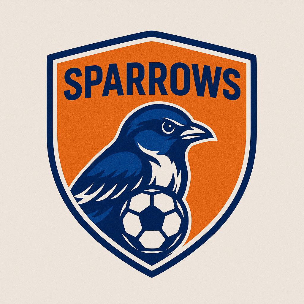
The first design of the logo, inspired by the shield of the formidable English teams. As the team's jerseys were orange and the club colors are blue & white, this first design worked well.
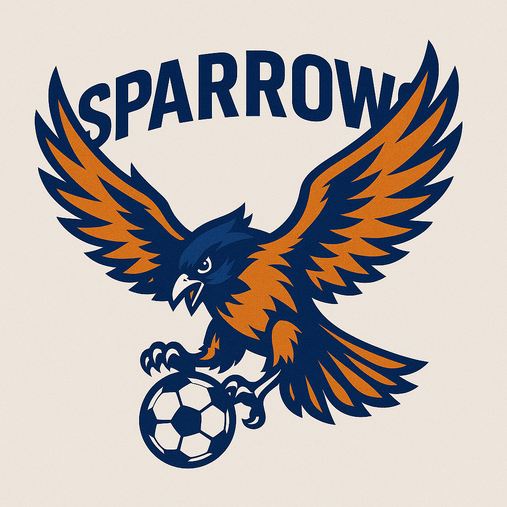
Taking another approach, this sparrow is a bit more fearsome. It doesn't present as well on a hat nor on apparel.
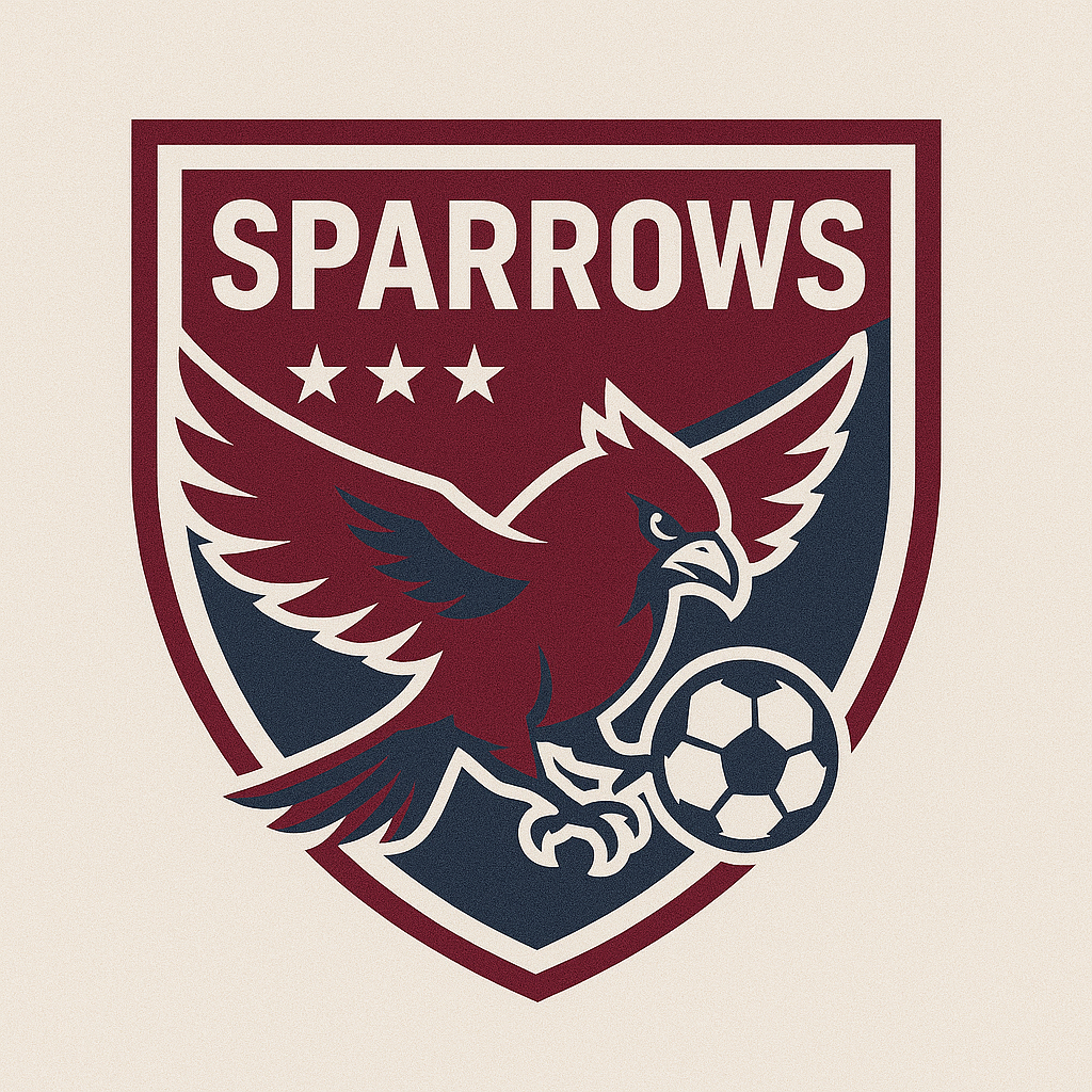
The jerseys for 25/26 were to be maroon, so this third attempt was modeled after American soccer club logos. Three stars for the three years the team has played together.
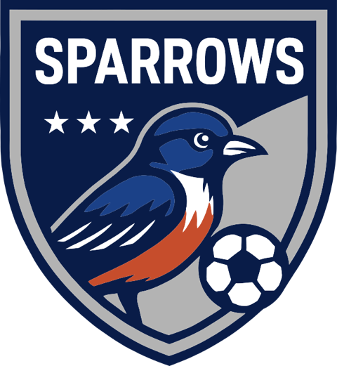
The final design, clean and crisp. An orange nod to the previous year's color. Blue and white to connect the Sparrows to the overall club. A strong crest that presents well on hats, warm-ups, and bags.